Hey there! 👋 I’m Vikas Sankhla, your big tech brother from Web Codder. Today, we’re going to learn how web pages adjust themselves on phones, tablets, and computers using CSS layouts. Let’s dive into this fun ride like we’re building Lego houses that change shape on demand! 🧱📱💻
🎯 What Are CSS Layouts?
CSS Layouts help us arrange content on a web page—like putting furniture in a room. 🛋️
It tells the browser where things should go and how they should behave on different screen sizes.
There are many layout techniques, but we’ll focus on the most useful and modern ones:
- Flexbox
- Grid
- Positioning
- Media Queries
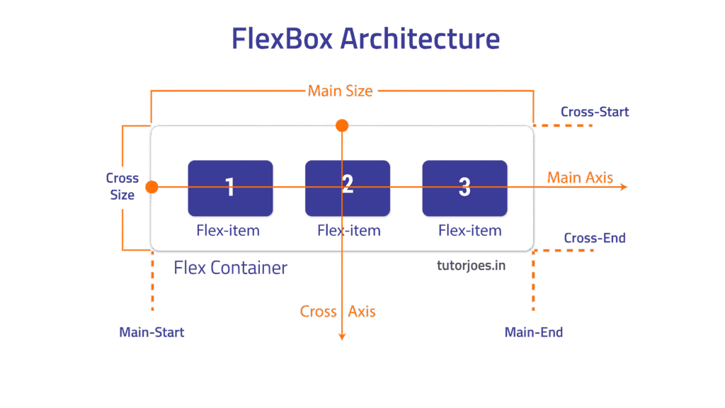
🔧 Flexbox – One-Dimensional Layout Tool
Flexbox is like a smart row or column that adjusts its items.
🤹♂️ Use Case:
Perfect for navigation bars, cards in a row, or aligning things in a straight line.
🧪 Example:
<div class="container">
  <div>Box 1</div>
  <div>Box 2</div>
  <div>Box 3</div>
</div>
.container {
  display: flex;
  justify-content: space-between;
}
📌 Key Properties:
display: flexjustify-contentalign-itemsflex-direction

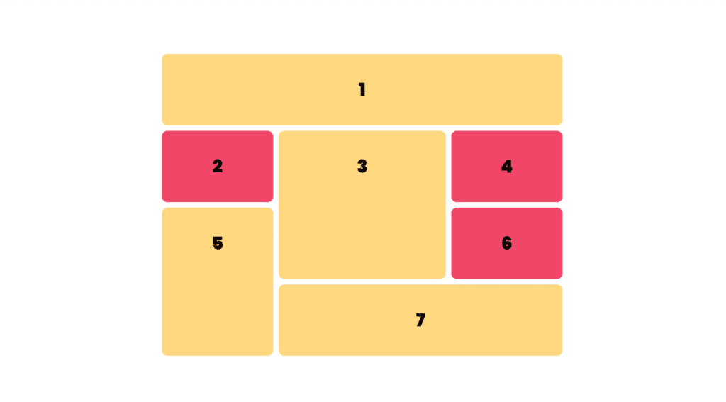
🧱 Grid – Two-Dimensional Layout Tool
Grid is like creating a spreadsheet layout. Rows and columns! 🧩
🤹♂️ Use Case:
Ideal for complex layouts, dashboards, galleries.
🧪 Example:
<div class="grid-container">
  <div>Item 1</div>
  <div>Item 2</div>
  <div>Item 3</div>
</div>
.grid-container {
  display: grid;
  grid-template-columns: 1fr 1fr 1fr;
  gap: 10px;
}
📌 Key Properties:
display: gridgrid-template-columnsgrid-template-rowsgap

📍 Positioning Elements
Sometimes, we want to manually place items.
📌 Types:
static(default)relativeabsolutefixedsticky
🧪 Example:
.banner {
  position: sticky;
  top: 0;
}
📌 Sticky headers stay on top when you scroll. Super cool! 😎
📱 Media Queries – Making Layouts Responsive
This is the magic that makes your website look good on all screens.
🧪 Example:
@media screen and (max-width: 600px) {
  .container {
    flex-direction: column;
  }
}
If the screen is small (like a phone), items stack vertically. 📱
![1.4 Css Layouts – Building Responsive Pages 3 Responsive Design Example]](https://webcodder.dev/wp-content/uploads/2025/05/Breakpoints-1024x536.webp)
🎯 Comparison Table – Flexbox vs Grid
| Feature | Flexbox | Grid |
|---|---|---|
| Layout Type | One-Dimensional | Two-Dimensional |
| Axis Control | Row or Column | Row and Column |
| Use Case | Navbars, Cards | Dashboards, Galleries |
🧠 Tips to Master Layouts
- Play with flexbox first. It’s simple and powerful.
- Use grid for structured layouts.
- Combine media queries to make pages responsive.
- Inspect pages in browser DevTools to see layout in action. 🔍
📦 Bonus: CSS Units Cheat Sheet
| Unit | Meaning |
|---|---|
| px | Pixels |
| % | Percentage |
| em/rem | Relative to font |
| fr | Grid fraction |
📌 Conclusion
Now you know how to control your web page layout like a pro! 🎉
Try building your own landing page using Flexbox and Grid.
And hey, don’t forget to follow us for more amazing guides! 🚀
🔔 Subscribe here: YouTube/WebCodder
📚 Explore tutorials: WebCodder Automation Blog
💬 Connect with us: WhatsApp Community
See you in the next tech adventure! 🌐👨💻


