Hey buddy! 👋 I’m Vikas Sankhla, your tech cousin from Web Codder. Today, let’s talk about CSS Frameworks—your web design shortcut superheroes. 🦸♂️💻
These tools help you build websites faster and smarter. Let’s break it all down in a super fun and easy way!
🚀 What is a CSS Framework?
Imagine you’re building a LEGO house. 🧱
Instead of creating each piece from scratch, you use pre-made blocks.
That’s what CSS frameworks do for websites—they give you ready-made styles and layouts.
💎 Popular CSS Frameworks
There are many frameworks, but here are the top 2 every beginner should know:
1. Bootstrap 🅱️
- Created by Twitter
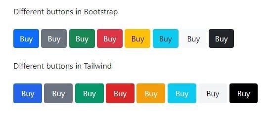
- Comes with pre-styled buttons, forms, modals, and more
- Great for quick and responsive designs
2. Tailwind CSS 🌬️
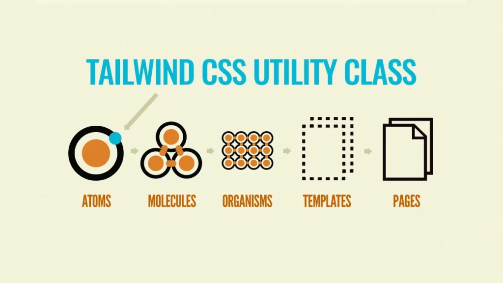
- Utility-first framework
- You write classes directly in your HTML
- Very flexible and modern

🧪 How to Use a CSS Framework
Let’s try Bootstrap as an example:
✅ Step 1: Add Bootstrap to your HTML
<link href="https://cdn.jsdelivr.net/npm/[email protected]/dist/css/bootstrap.min.css" rel="stylesheet">
✅ Step 2: Use Bootstrap classes
<button class="btn btn-primary">Click Me</button>
🎉 Done! You just got a styled blue button.
🛠️ Tailwind CSS in Action
Tailwind works a bit differently:
✅ Example:
<button class="bg-blue-500 text-white px-4 py-2 rounded">Click Me</button>
This gives you full control with tiny utility classes.

⚙️ Customizing and Overriding Styles
You don’t have to stick with default styles. You can customize them!
🔄 In Bootstrap:
.btn-primary {
  background-color: #ff5722;
  border: none;
}
🔄 In Tailwind:
Create a tailwind.config.js file and extend your theme.
module.exports = {
  theme: {
    extend: {
      colors: {
        customOrange: '#ff5722'
      }
    }
  }
}
🛠️ Now use it like this:
<button class="bg-customOrange text-white">Click</button>
📐 Grid Systems in Frameworks
Both frameworks support responsive grids.
🟪 Bootstrap Grid:
<div class="row">
  <div class="col-6">Left</div>
  <div class="col-6">Right</div>
</div>
🟦 Tailwind Grid:
<div class="grid grid-cols-2">
  <div>Left</div>
  <div>Right</div>
</div>

🌍 Responsive Frameworks
Both Bootstrap and Tailwind are mobile-first.
This means your website will look awesome on phones 📱, tablets 📲, and desktops 💻.
You can even control how things look on each screen size using breakpoints!
📱 Tailwind Example:
<div class="text-sm md:text-lg lg:text-xl">
  Responsive Text
</div>
📱 Bootstrap Example:
<div class="d-block d-md-none">Only on small screens</div>
📊 Quick Comparison Table
| Feature | Bootstrap | Tailwind CSS |
|---|---|---|
| Style Approach | Pre-designed components | Utility-first classes |
| Learning Curve | Easy for beginners | Steeper but flexible |
| Customization | Moderate | Very High |
| Responsive | Yes | Yes |
🧠 Final Tips
- Use Bootstrap if you want fast results.
- Choose Tailwind if you love full control.
- Customize to match your brand or style.
- Always check docs – they’re your best friend! 📖
📌 Conclusion
CSS Frameworks = Speed + Style + Simplicity 💥
Next time you build a webpage, try using one.
It’ll save hours of time and give you polished results.
👉 Don’t forget to subscribe and follow Web Codder for more tech fun! 🚀
🔔 Subscribe: YouTube/WebCodder
📘 Learn more: Automation Guides
💬 Join us: WebCodder WhatsApp
See you in the next lesson, tech champ! ✨


